Do you want to add a full-screen welcome mat to your website?
A welcome mat is a full-screen, dynamic overlay that can help you get more newsletter subscribers, eBook downloads, sales to your products, and more.
In this article, we’ll share how to create a welcome mat for your WordPress site, along with some great welcome mat examples to learn from.

Why a Welcome Mat Can Boost Your Conversions
More than 70% of visitors leaving your WordPress website will never return unless you convert them into email subscribers or customers.
A welcome mat is a large, full-screen interstitial that blocks the view of the rest of your website’s content to capture the user’s attention.
That might sound like a bad idea, but it’s a great way to get your message in front of visitors straight away.
If visitors don’t want what you’re offering, then they can simply close the welcome mat.
Of course, you’ll want to give people a good reason to sign up if you’re showing a welcome mat instead of an exit-intent popup, such as a discount code or even a freebie.
For example, you may have seen popular eCommerce stores offer a special discount using a full-screen welcome mat with gamification.
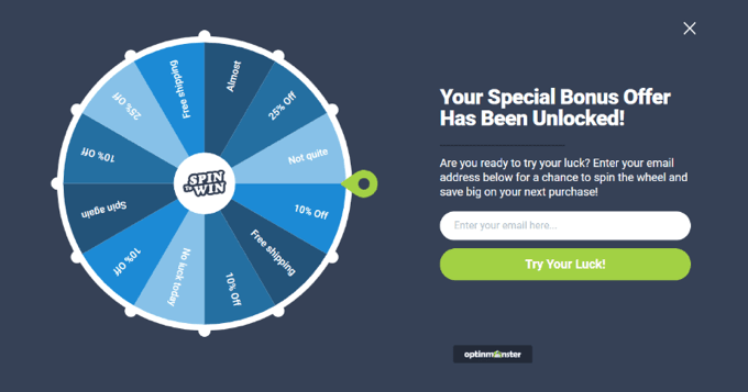
In other cases, you may have seen popular bloggers using a full-screen welcome mat to grow their email newsletter.

That being said, let’s take a look at how to easily add a welcome mat to your website.
How to Create a Welcome Mat for Your Website
The easiest way of creating a welcome mat in WordPress is using OptinMonster. It is the best lead generation software in the world and allows you to easily create optin forms, including welcome mats.
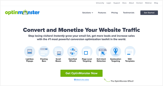
First, you’ll need to visit the OptinMonster website and signup for an account. You will need at least the Basic plan to create fullscreen overlays.
Next, you’ll need to install and activate the OptinMonster WordPress plugin. For more details, see our step-by-step guide on how to install a WordPress plugin.
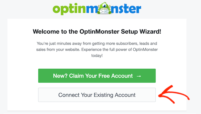
The plugin connects the OptinMonster app to your website. Once you’ve activated the plugin, you’ll see the setup wizard in your WordPress dashboard. Go ahead and click the ‘Connect Your Existing Account’ button.
Next, a new window will open.
Simply click the ‘Connect to WordPress’ button.

Now, you’re ready to create your welcome mat.
Creating a Welcome Mat for Your Website
You can head to OptinMonster » Campaigns to create a new campaign.
Go ahead and click the ‘Create Your First Campaign’ button to start creating your welcome mat.

A new window will now pop up where you can select pre-built templates or choose ready-to-use campaigns and lead magnets, inspired by successful brands. OptinMonster also gives you the option to hire a specialist to customize your campaigns.
For this tutorial, we will use the ‘Templates’ option.
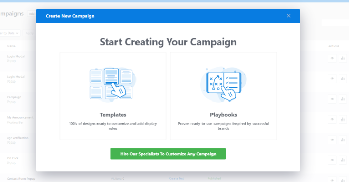
This will take you to the OptinMonster campaign builder.
Next, choose ‘Fullscreen’ for your campaign type.
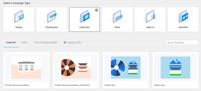
You’ll need to choose a template for your campaign. We will use the ‘Entrance’ template, but you can pick a different one if you want.
Once you’ve selected a template, go ahead and enter a name for your campaign and click the ‘Start Building’ button.

Next, you can customize your campaign using the drag-and-drop builder. You can change anything you like here.
There are different blocks that can be added to the campaign, like images, text, buttons, and more. You’ll also want to edit the text to correspond to your offer.
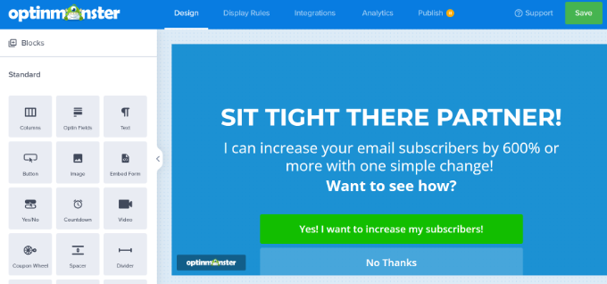
Simply click on any element, and you’ll see that you can edit it in the left-hand pane.
For instance, we will change the headline of the full-screen welcome mat for our demo campaign.
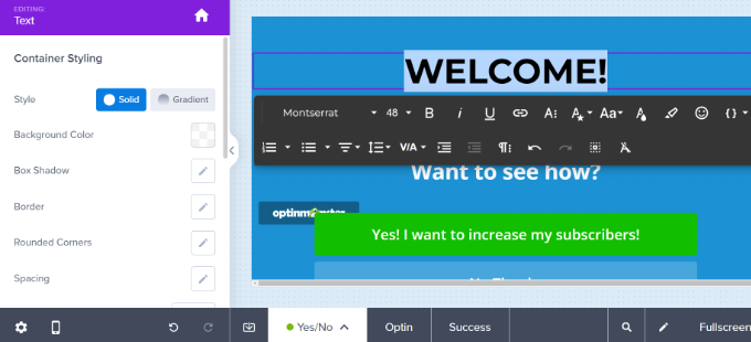
The next step is to let your welcome mat slide in. You can do this by clicking the Settings gear icon on the bottom left-hand side.
From here, you need to toggle the ‘Display a Page Slide?’ option to enable it.
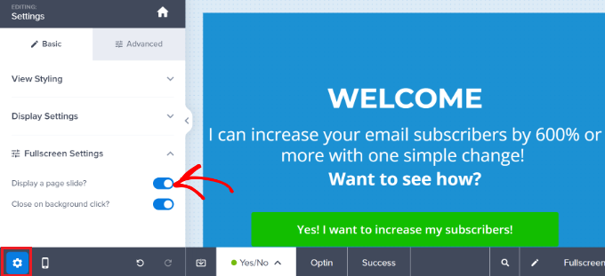
This means your welcome mat will slide down from the top of the screen instead of fading into view.
Next, you need to switch to the ‘Success’ view of your welcome mat. This is what your users will see after they perform the desired action. If you want, you can customize the success view or use the default template.
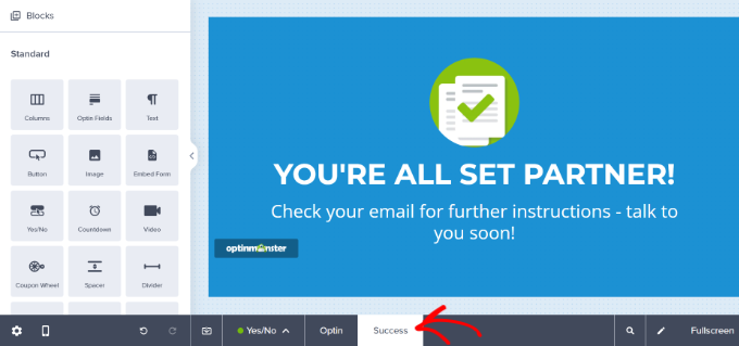
Once you’re happy with your welcome mat, you can set up how it will display on your site.
Displaying the Welcome Mat on Your WordPress Site
You can set how to display your welcome mat popup by switching to the ‘Display Rules’ tab in OptinMonster.
There are lots of personalization and targeting options like users’ location, what items they have in their eCommerce cart, what they have done previously on your site, exit intent, and more.
By default, OptinMonster campaigns display on all pages of your site after the visitor has been there for 5 seconds.
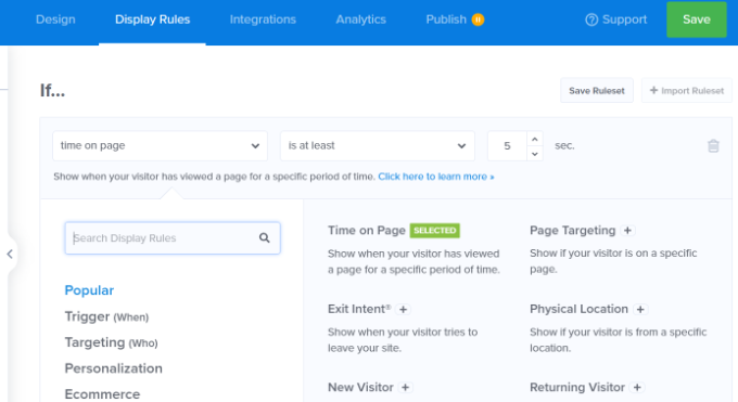
Since this is a welcome mat, you’ll probably want it to display immediately. Just change this value to 0 seconds.
By default, the welcome mat will display on every page of your site. You can easily include or exclude specific pages by using OptinMonster’s personalization rules.
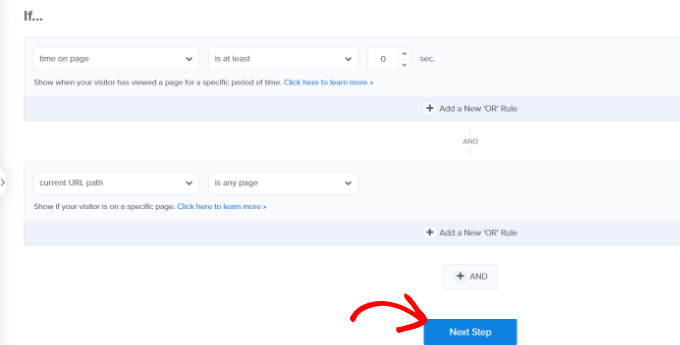
You can click the ‘Next Step’ button when you’re done.
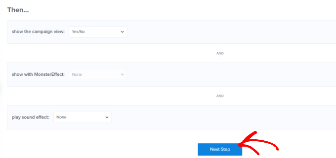
Next, you’ll see more options for displaying your campaign. For instance, you can add an effect or play a sound when the campaign appears on a user’s screen.
For this tutorial, we’ll use the default settings and click the ‘Next Step’ button.
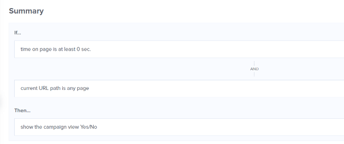
On the next screen, you will see a summary of your display rules settings.
You can edit the settings before publishing the campaign.
Once you are ready to make your welcome mat live, simply go to the ‘Publish’ tab at the top of the screen.
Go ahead and change the Publish Status from ‘Draft’ to ‘Publish.’
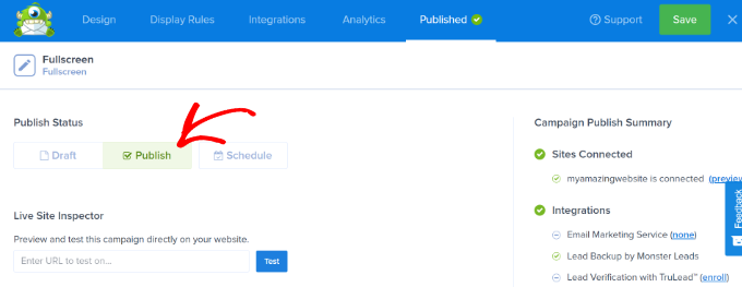
Don’t forget to click ‘Save’ to store your changes and close the campaign builder.
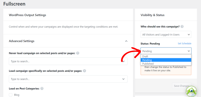
Next, you will see WordPress Output Settings for your campaign. Make sure that your campaign is published.
If it isn’t, then simply click the Status dropdown menu and select the ‘Published’ option. Don’t forget to click the ‘Save Changes’ button when you’re done.
To check out your campaign, you can visit your website in a new incognito browser window.
You should see your welcome mat slide in seamlessly from the top of your screen.
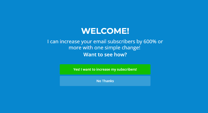
Examples of Great Welcome Mats
Let’s take a look at some welcome mat examples from different industries. For each, we’ll go through what they’re doing well, plus any minor changes we might suggest.
1. Singularity
This welcome mat from Singularity prompted users to sign up and watch the livestream of the Singularity University Global Summit. It was hugely successful and captured over 2,000 new email signups in under 9 days.

We particularly like the great use of the logo, the clear fonts, and the bright “Remind Me!” button.
2. Goins, Writer
This welcome mat from Goins, Writer offers a free guide. It’s a clear, simple offer, and the minimalist design is in keeping with the rest of the website.

We feel that the “Yes” and “No Thanks” buttons are clear and easy to use, and the use of numbers in the headline makes for a compelling offer.
3. AVweb
This welcome mat has a large, clear image of a small airplane. It’s instantly eye-catching.

We like the great image, and the clear “Sign Me Up!” call to action. One small possible tweak would be to shorten the tagline to avoid having it cover the top of the image.
4. Loaded Landscapes
This welcome mat from Loaded Landscapes is a little different from other examples. The background is slightly transparent.
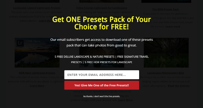
We like the clear offer and the enthusiasm of the red call to action button. The background of the site beneath the welcome mat could be a little distracting, so it might be worth changing it to be fully opaque, however.
5. OptimizeMyBnb
This welcome mat was used on a specific page, which was included as a clickable link inside a book the website owner sold through third-party retailers. These retailers didn’t pass on customers’ details, though. Using a welcome mat in this way helped capture customers’ email addresses.
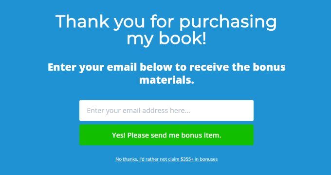
We feel the very clear headline, subheading, and call-to-action text all worked well, and that the ‘no, thanks’ button is used well to give the user sense of FOMO.
There are dozens more full-screen welcome mat examples that you can see, but we didn’t add them all in this guide.
If you’re looking for more inspiration, here are some things you can do with a fullscreen welcome mat:
- Present a targeted offer or coupon
- Showcase new products and services
- Let visitors know what to expect from the site
- Win new subscribers by highlighting their best content
- Point visitors to their social media profiles
- Collect email subscribers as part of a prelaunch phase
If you’re serious about improving your website conversions, then welcome mat and even exit fullscreen interstitials are some of the highest converting elements you can add to your website.
We hope this article helped you learn how to create a welcome mat for your website and that you found the examples inspiring. You may also want to take a look at our comparison of the best email marketing services, and our list of the must-have WordPress plugins.
If you liked this article, then please subscribe to our YouTube Channel for WordPress video tutorials. You can also find us on Twitter and Facebook.
The post How to Create a Welcome Mat for Your WordPress Site (+ Examples) first appeared on WPBeginner.
Dr Crash says:


